Example: Graphs and plots
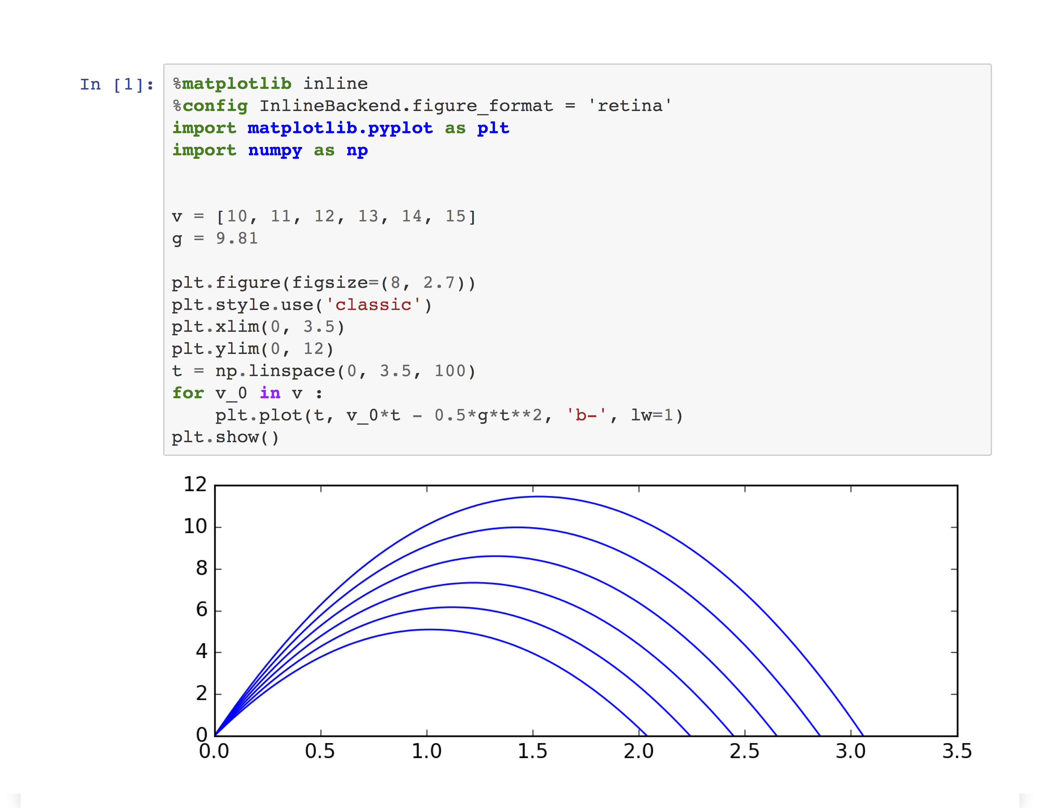
Bad: The plot has no title and axes don’t have labels. There are several curves in this plot (each corresponding to a different value of a parameter), but all of them are plotted using the same color and there is no indication which value of the parameter gives which curve.
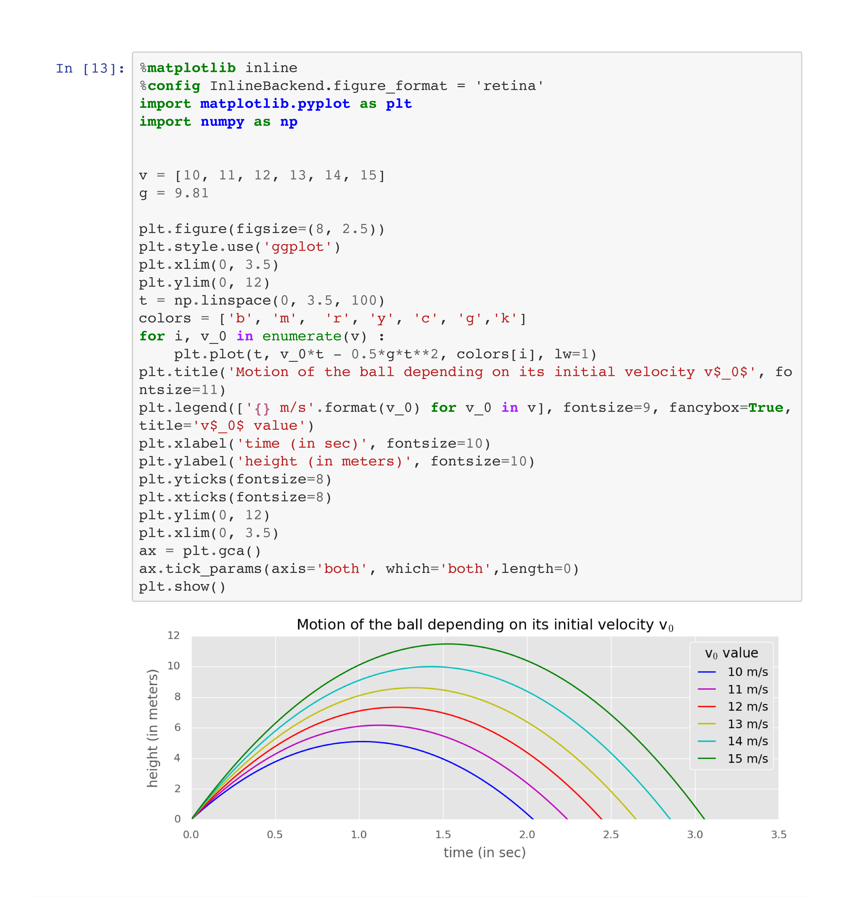
Good: The plot has a descriptive title and its axes have labels. Each curve in the plot has a distinctive color, and the legend explains which color corresponds to which value of the parameter.